In the competitive digital world of ours, your website creates the first impression for your potential customers. If it does not function smoothly on mobile devices, you risk losing both visibility and revenue. With smartphone users dominating online activity, Mobile Responsive design is no longer optional.it is a core business requirement.
Search engines now prioritize mobile usability, website performance, and page experience as major SEO ranking factors. At the same time, users expect fast, seamless browsing across all screen sizes. Businesses that ignore mobile website optimization often see higher bounce rates and lower conversions.
Let’s explore why mobile-responsive websites matter so much for SEO and conversions in 2026 and beyond.
What Is Mobile Responsive Design?
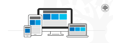
Mobile Responsive design is a development approach that allows a website to automatically adjust its layout, images, and content according to different screen sizes. Whether someone visits your site on a smartphone, tablet, laptop, or desktop, the experience remains consistent.
Instead of creating separate versions for mobile and desktop, a responsive website design uses:
- Flexible grids
- Adaptive layout systems
- Screen size optimization
- Fluid images
- Responsive typography
This ensures cross-device compatibility and improves overall website user experience.
Why Mobile Usage Dominates in 2026
Mobile usage continues to grow every year. Most online searches, product comparisons, and social interactions now happen on smartphones. Consumers expect instant access to information wherever they are.
Key Trends Driving Mobile Dominance
- Increase in smartphone users worldwide
- Faster mobile internet speeds
- Growth in mobile shopping
- Voice search and AI integration
- On-the-go browsing behavior
When users land on a non-mobile-friendly website, they leave quickly. This directly affects bounce rate reduction efforts and weakens engagement signals.
Simply put, businesses must adapt to mobile behavior or risk losing relevance.
How Mobile Responsive Design Impacts SEO
Search engines evaluate websites based on user experience and technical performance. A mobile-friendly website plays a major role in improving SEO.
Direct SEO Benefits of Responsive Web Design
- Improved website loading speed
- Lower bounce rate
- Better crawlability
- Stronger engagement metrics
- Consistent URL structure
Mobile optimization improves website performance, which is a key ranking factor. When users stay longer on your site and interact with content, search engines interpret that as value.
In contrast, poor mobile usability leads to ranking drops and reduced organic visibility.
Google’s Mobile-First Indexing Explained
Google now uses Google mobile-first indexing. This means the search engine primarily evaluates the mobile version of your website to determine rankings.
If your site is not properly optimized for mobile devices, your SEO performance will suffer — even if your desktop version works perfectly.
What Mobile-First Indexing Means for Businesses
- Mobile content must match desktop content
- Structured data must be consistent
- Website speed must be optimized
- Navigation must be simple and touch-friendly
A strong mobile optimization strategy ensures your site remains competitive in search results.
Benefits of Responsive Web Design for Businesses
Investing in responsive web design offers both technical and business advantages.
1. Cost Efficiency
Maintaining one responsive site is more affordable than managing separate mobile and desktop versions.
2. Better Website User Experience
Users enjoy smooth browsing, easy navigation, and readable content across all devices.
3. Improved Website Performance
Optimized layouts reduce unnecessary elements, improving speed and usability.
4. Stronger Brand Credibility
A mobile-friendly website signals professionalism and trustworthiness.
5. Higher SEO Rankings
Search engines reward sites that prioritize mobile usability and page experience.
These benefits make responsive website design a strategic investment rather than a design trend.
Impact on Conversions and Sales
A responsive website directly influences conversion rates. When users find it easy to browse, click, and complete actions, they are more likely to convert.
How Mobile Optimization Boosts Conversions
- Faster loading pages reduce abandonment
- Simplified forms increase sign-ups
- Clear call-to-action buttons improve clicks
- Seamless checkout improves sales
- Better interface design builds trust
If a website is hard to use on a smartphone, users leave immediately. That lost traffic means lost revenue.
In contrast, smooth mobile usability builds confidence and encourages purchase decisions.
User Experience and Mobile Usability
User experience is central to both SEO and conversions. A responsive design ensures:
- Text is readable without zooming
- Buttons are easy to tap
- Navigation menus are simple
- Images scale properly
- Pages load quickly
Poor user interface design creates frustration. When visitors struggle to navigate, they exit the site quickly.
Improving mobile usability reduces bounce rate and increases engagement — both critical for SEO success.
Common Mistakes in Mobile Responsive design
Even businesses that attempt mobile optimization sometimes make costly errors.
Common Issues to Avoid
- Slow loading speed due to large images
- Pop-ups that block content
- Tiny fonts and crowded layouts
- Non-clickable elements
- Inconsistent content between devices
Ignoring adaptive layout principles leads to poor performance and reduced rankings.
Regular audits help identify technical weaknesses before they impact conversions.
How to Check If Your Website Is Mobile-Friendly
Testing your website regularly ensures consistent performance.
Simple Ways to Evaluate Mobile Optimization
- Use Google’s Mobile-Friendly Test
- Check page speed insights
- Review mobile usability reports in Search Console
- Test manually on different devices
- Analyze bounce rate and session duration
Monitoring these factors helps maintain strong website performance and search visibility.
Future of Mobile Optimization
Mobile technology continues to evolve rapidly. Businesses must stay ahead of emerging trends.
What to Expect in the Future
- AI-driven personalization
- Faster mobile networks
- Voice search optimization
- Enhanced progressive web apps
- Greater focus on accessibility
As digital habits shift further toward mobile devices, responsive web design will remain a fundamental part of SEO and growth strategies.
Organizations that invest early in mobile-first experiences will maintain long-term competitive advantage.
Conclusion
In 2026, mobile responsive design is not just about how a website looks — it plays a key role in visibility, trust, and business growth. With Google’s mobile-first indexing and most users browsing on smartphones, mobile optimization directly affects search performance and conversions.
A mobile-friendly website improves user experience, lowers bounce rate, and supports stronger rankings. Choosing Xplore Intellects, an experienced website design company in Coimbatore, ensures your website is built with practical design standards that work smoothly across devices.
Businesses that give importance to mobile responsiveness stay ahead and build long-term credibility in today’s mobile-driven digital space.
FAQs
1. What is responsive web design?
Responsive web design allows a website to automatically adjust its layout to fit different screen sizes and devices.
2. Does mobile optimization improve SEO?
Yes. Mobile optimization improves website performance, user experience, and search engine rankings under Google mobile-first indexing.
3. How does mobile usability affect conversions?
Better mobile usability reduces bounce rates and makes it easier for users to complete actions like purchases or form submissions.
4. Is responsive design better than a separate mobile website?
Yes. A single responsive website ensures consistency, lower maintenance cost, and better SEO benefits.
5. Why is website loading speed important for mobile?
Slow loading speed increases bounce rate and negatively impacts both SEO ranking factors and user satisfaction.